Star Field Background

StarField01

Here is a star field image I made following a tutorial I found online. Everything’s pretty much scratch-built save for a few of the prominent stars, which I made using Obsidian Dawn’s amazing Sparklies Brushes. Check out her website. It’s full of amazing free resources and her Sparklies and Tech Brushes are my go-to brushes for this sort of thing.

Details:
Software: Adobe Photoshop CS4
Image Resolution: 300 dpi


Comms Panel, Sci-Fi

Console02

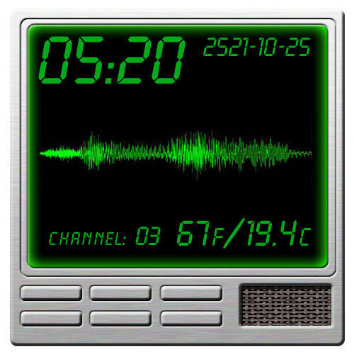
I made this some years ago, playing around with layer styles in Photoshop. Of course, I had to justify the exercise by making a dungeon map object out of it. Dungeon maps and map objects–graphics made specifically for use in RPG maps and game play–isn’t new. Many sites online are dedicated to them, which is where I got the idea. I intended to use it in a deck plan for a ship we were using in an RPG campaign, but the plans never got that far even though the campaign itself ran for several years.

For those who might be curious, the font I used is Dakota. It came with my version of Microsoft Word and I do not know if it is still available. A reasonably close match, Digital 7, can be found here.

The image itself is 500 pixels by 500 pixels at 200 dpi. Were I to do this over again, I’d bump it up to 300 dpi, the minimum printers require nowadays. Shown actual size on the web, 72 dpi should be sufficient but if blown up beyond 500 pixels to a side it suffers a little even at 200 dpi.

The brushed metal was scratch-made in Photoshop and the speaker grill texture was something I made so danged long ago, I can’t say now how I made it. It’s saved in my files, though, so I can reload it once I get a new version of CS. (Which, given the CC subscription model Adobe is pushing these days, looks to be increasingly unlikely. But a gal can still dream, can’t she?)


Vintage Collage, Untitled

Vintage, untitled

I made this for a notebook cover. I laser printed it on a full-sized shipping label at my local office store, rounded the corners, and applied it. It made a rather nifty cover. I may do more of these.

For now, here is the image I used.

Just about all of the images used are in the public domain, printed on or before 1923. I used Photoshop brushes that were created after 1923 and are covered by personal/fair use.

Note:
I saved this as a png at 32 bit depth, but if memory serves, I believe I made this at 300 dpi. The next time I open the psd file, I’ll take a look and note it here.

Update, 05 Mar 2016:
It’s 8″ x 6.5″ and at 200 dpi.


Winnowing the Mental Squirrels

I may be complicating this blog too much by having a separate page for my posts AND artwork.

I thought perhaps I would make a blog out of the artwork I produce, given I am likely to post my art with tons of notes and trivia no matter what.

Having a separate page for non-art posts? It’s looking redundant now.

Hmm … how to change things around?

I guess I’ll be futzing with the settings. Here’s hoping I don’t screw it up.
 
 
Two minutes later…:
Well. That was easy.
Yay me for not screwing it up!
 
 
Ten minutes later…:
And I’m now using the Lovecraft theme instead of Big Brother. I like how it’s organized better, to say nothing of Big Brother’s line spacing. My eyes just didn’t like it.

Also? Lovecraft’s header can accommodate a nice big piece of art! Which I expect I’ll spend my free time today making. 😉